About Me

Most people call me Flagg. I'm from a small town south of St. Louis and just graduated from the University of Missouri. Photojournalist by trade, I use this blog to visualize my life and surroundings. Aside from photo, my great loves are my family, food, the St. Louis Cardinals and Queen. I'm open to go anywhere in the world and experience everything.

Sunday, November 1, 2009

Multimedia Critique 2

Tim Matsui is a photojournalist who specializes in environment and human trafficking stories. Focusing on hope, he has done several informational multimedia pieces for non-government organizations. In a piece for WL Gore called Cambodia: Victim to Survivor, he explored the human trafficking industry in Cambodia.

In an extremely moving piece, Matsui uses audio, interviews, video and photography to focus on the informational side rather than personal stories. The project was well mixed with video and photography starting out with a video and title text that I would like to incorporate into my final project.

For more dramatic text throughout the story, white letters appeared on a black background. The words were statistics, countries, or info clips. While this was extremely effective for the dramatic mood of the presentation, it is inappropriate for my project. The music throughout the piece was also fitting as was the speed of the photographs in accordance with the music.

Aside from the video at the beginning, the only other video was interview clips. To be honest, watching someone talk is much less appealing than having audio superimposed over pictures or other video. I will have no direct interview video in my project. The only part of this story I disliked was the too-quick transition from a sad story to happy, to sad again. Feeling a bit bipolar, at the end, I didn’t know if I should feel hopeful or cheerless. I will make sure my transitions in my project are clear.

Technically, the ability to hide the play/pause buttons and status bar is something I would like to learn. As a naturally distracted person, I catch myself looking at status bars instead of focusing on what I am watching. Is this possible in Flash?

The design of the story is very simple, with a white background and logo at the top of the page, and a small, informational sentence at the bottom of the page.

Thursday, October 15, 2009

EPJ Multimedia Critique 1

This project was a story about a woman from Africa who survived AIDS by taking anti-viral medicines after she had lost two partners and her son to the disease. Also, the story included the news anchor that has helped spread her success story to gain funding for other victims. The technical sides of the project were flawless. The audio was perfectly clear, pictures artistically done and the video even had picture overlays. The video included a button to make it large screen and volume controls with a way to skip to the beginning or end.

The user doesn’t have control of the project, as there is no interactivity besides play or pause buttons and chapters are not included. However, this adds to the simplicity of the story. AIDS isn’t an easy topic to develop with interactivity.

Aside from photographs, the piece had a live video interview which gave it a news story feel for legitimacy, but still kept the photo and personal feel. Photographs were inserted at visually expectant places and when we needed explanations, interview video was played. The slow transitioning of the pictures and the breaking up of pictures in Flash was very well done. I would like to include how some pictures fade-in in pieces in my final project.

The surrounding color scheme was the only thing I hated. The MSNBC logo was necessary, but the bright color montage in the background was distracting and inappropriate for the content. A black background would have been much more effective. A side bar also appeared next to the piece, but was not distracting.

Wednesday, September 30, 2009

EPJ Website Critique 2


The portfolio website of Penny De Los Santos contrasts sharply with the last critique I did of National Geographic photographer, Joel Sartore. De Los Santos is a photojournalist from Texas who has also worked for National Geographic, but has taken her photography to a food level. Literally, she integrates her journalistic talents to food in different cultures.

Anyway, I met Penny at the Missouri Photo Workshop I’m helping with this week (more details to come later). In stalking her and the other faulty members, I found her web site and decided to use it for this assignment.

De Los Santos’s website is plain and clear, much like her food photography. Both the pictures and the sit complement each other well. The white background on the site goes with the white plates featured in many of her shots. The site is also easily navigable. Home, and category buttons are at the top of every page. Her portfolio button becomes a drop-down menu featuring her galleries. I have mixed feelings about this. I like that a user can choose what they view first, but I don’t like pictures not accompanying the gallery titles. Also, the light gray font color blends into the main image on the home page. The galleries don’t become impossible to read, but become more difficult.

I’ve decided I like the look of top navigation rather than on the left side like I have on my site. My name will need to be a little smaller and aligned left and then my categories will be smaller on the right.

In her galleries, she has a scroll bar to the left but without navigation arrows. Users must move their arrow up and down the pictures to click to enlarge; I think arrows would make it easier. De Los Santos has anywhere from 20-32 pictures for each gallery. While I do not have that many good pictures for my site, I love the variety and amount she has.

Lastly, in her bio category, she has links on words like ‘family.’ A new window will pop up with a little blurb about her family. I love this. Many people want to share their family, but not necessarily everyone wants to read about it. With this interactive tool, people have the option to learn more.

Sunday, September 20, 2009

EPJ

This semester, I am enrolled in a class called Electronic Photojournalism. Although not required, I decided to take this class to expand my non-existent knowledge of web-site building, Flash and other aspects of outside-camera photography.

The class requires a blog, so I will occasionally be posting assignments as well as my current photography. I bought a domain name and will also be building a real website throughout the semester!

Our first assignment is a web site critique.

For my first critique, I chose to analyze Joel Sartore’s photography web site. Mr. Sartore has been one of my favorite photographers since I first picked up National Geographic Magazine in high school.

I’ve visited Mr. Sartore’s site many times, but never for ease and content review. The gray background with white type makes his site stand out from the average black or white photography backgrounds.

Mr. Sartore included links at the bottom of each page to return to the home page, galleries, bio, store and stock as well as links to Facebook and Twitter.

The home page displayed three big pictures. Two linked to galleries and had a slideshow effect that I would like for my site. The third was a personal story photograph. The site displayed Mr. Sartore’s current work on amphibians along with his updates to his old work. A short description also accompanied every gallery, which helped distinguish his different projects.

Mr. Sartore’s site is all-inclusive. Not only does he have a biography and blog, he has a section of frequently asked questions and links to his field notes. While this is unnecessary for my site, I respected that he is willing to share his knowledge easily. He also has forms for contact and many contest and information links for great interactivity.

What I did not love about the site was the sidebar distractions. The sidebars were links containing more of Mr. Sartore’s videos and information or National Geographic advertisements. While they were organized, they distracted me. Without the bars, the main images could have been bigger.

This class also requires a final project incorporating multimedia. I only have one project idea so far. The St. Louis Cardinals are having a break-through season. My family has season tickets and I would like to do a project on the Cardinals while they finish their season. I can interview fans, and photograph games to create the story of the end of their season.

Mizzou Volleyball

I've been attending some of the Mizzou women's home volleyball games, here are some pictures from the stands:
Jubilation after winning only 1 of 4 games.
Julianna Klein is an amazing outside hitter and her sophomore year, she tore her ACL. Sound familiar? For my Fundamentals in Photojournalism class, I did a photo story on her and her recovery as a two-time ACL destroyer. It makes me so happy to see her out on the court again kickin ass.

Columbia Missourian

Hi! I know it's been a while, but this has truly been a summer of photography. I stayed in Columbia this summer and was a Staff Photographer for the Columbia Missourian. While working, I covered anything from the Show-Me-State games to the Harry Potter premiere to a portrait about a private investigator. Eventually, I'll include links to multimedia in addition to my photos.

I really enjoyed the random assortment of things I did for the paper this summer. Although challenging, it gave me the experience of a daily newspaper staff photographer.
Boone County Horse Fair
So apparently, Centralia, Missouri is the land anchor capital of the world. They're the leading manufacturer of the things that drive holes into the ground. Every year, they have a town celebration called Anchorfest and no joke- an anchor driving competition. In probably one of the most entertaining sporting events, people of all ages compete to be the fastest anchor driver.
The City of Columbia is trying to pass an ordinance that allows its citizens to own chickens. Bluck Blaahhh.
Stephen's College dance rehearsal.
The Columbia Entertainment Company put on My Fair Lady this summer.
Two hysterical Show-Me-State game volunteers.
Columbia also played host to the regional Soap Box Derby this summer.
The two firefighter divisions in Columbia joined this summer and had training exercises.
50 and over softball: EPIC. These old guys can play better than I ever have.
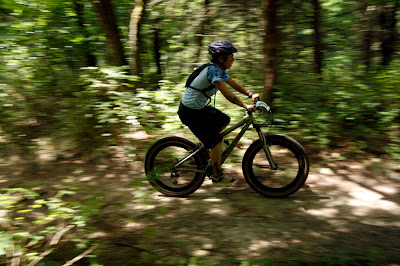
Show-Me-State Games mountain biking at Rock Bridge State Park. Yes, I did hide in the bushes.
Who knew kickball was an official sport at the Show-Me games
Summer concert series at Shelter Gardens
It rained on the Fourth of July, but all the staff photographers covered the fireworks show splendidly.
This was for a story about a woman who struggles financially and looks for free things to do with her kids.
At the Boone County Fair, a new animal show came which displayed exotic animals from hyenas to tigers to bears... and an adorable baby monkey.

Tuesday, June 30, 2009

Back in the Homeland

I survived 5 months in Europe, and am struggling to find things in Wal-Mart? Needless to say reverse culture shock is real- much more real that I ever imagined. Seeing my friends and family brought tears to my eyes, but after the initial home-shock was over, I was completely at a loss. What am I supposed to do now? Where do I go? Although I had plenty of tasks to keep me occupied, none of them ranked among Fashion Week or jetting off to Dublin for the weekend.

I knew I was moving back to Columbia, Missouri to take summer classes at Mizzou, but in the two limbo weeks I had at home, I was completely clueless. What helped me get through this strange parallel universe? Family, American food, and the St. Louis Cardinals.

After missing my first Opening Day in years and having to read updates instead rather than attend games, Dad gave me three Cardinals game tickets upon arrival home. Going to these games with family and friends made me realize what I missed most about America- companionship, familiarity, and an amazing baseball atmosphere.

Baseball Heaven and Cubs vs. Cards
22-year-old Colby Rasmus prepares for a bunt
Fly balls always make for entertaining faces
Soriano about to strike out
Another amazing play by the Cardinals
Nick Stavinoha connects with that ball
While pitcher Sean Marshall looks on, the Cubs make the one good play at their loss of a game.

Cards vs. Royals was the third game I attended right after the sweep of the Cubs. Of course, the Cardinals won again, 5-0.
Albert Pujols crouches to out outfielder David DeJesus.
Skip Schumaker rockets one out to centerfield
The umpire looks confused, as if he didn't expect Royals Teahen to catch the ball
The night before, Albert slammed one out to Big Mac Land and injured the 'I.' Free Big Macs for everyone!!!!
Kyle McClellan prepares for a strike
Now that I am back in Columbia, I am lifeguarding at Oakland Community pool, teaching water aerobics at Lake of the Woods country club, taking two classes, and taking pictures as a staff photographer at the Columbia Missourian. News pictures are coming next!

Wednesday, June 24, 2009

Cheerio London!

Just a compilation of my last days/weeks in London, where I worked, and a photo tribute to how much I'm going to miss everything.
The Wobbly Bridge and St. Paul's Cathedral
A stroll in St. James's Park

Squirrlin' Around
Even pigeons can be pretty

100 Victoria St, known as Cardinal Place is the headquarters of MSN UK, aka the most incredible job ever created. This glass palace is my office building, complete with hot chocolate machine. My ridiculously fantastic boss, Laura.
My last Sunday in London was the day of the London Marathon.
 
Camping in Wales